
You’ve probably seen Claude Design pop up in your feed and thought one of two things: that looks cool or wait, is that different from Claude? Maybe both. It’s newer, it lives in a weird corner of claude.ai, and nobody seems to explain what it actually does without making it sound like a complete reinvention of the wheel.
Here’s the short version: Claude Design is a visual mockup tool built into Claude’s web app. It’s great. It also has usage limits that will humble you if you’re not careful. This guide walks you through what it is, who can use it, and how to get real results from it without burning through your weekly quota on your first session.
What Claude Design Actually Is
Claude Design is Anthropic’s answer to Google Stitch — a tool that lets you create visual mockups for web apps, mobile apps, slide decks, and design systems directly inside Claude’s interface. Instead of going back and forth with Claude Code and refreshing a dev server to see if your colors look right, you’re working in a visual-forward environment where you can actually see changes in real time.
Think of it less like a design tool (it’s not Figma) and more like a visual iteration engine. You give it a prompt, it generates a mockup, and then you tweak, remix, and refine until it looks like something you’d actually ship.
What makes it genuinely useful is a two-part system:
Tweaks — micro-level adjustments. Colors, fonts, corner radius, accent weights, background style. You can dial these in without writing a single prompt. Just click and watch the design update live.
Variants — macro-level changes. Want to see your landing page as a brutalist newspaper layout instead? Ask for it. Design will generate two or three completely different visual directions you can compare side by side. Then once you find a macro direction you like, you zoom in with the tweaks.
Together, those two things are where Claude Design pulls way ahead of doing this work inside Claude Code.
Who Can Use It (And Who Can’t)
Here’s the part most guides skip: Claude Design is not available on the free tier. You need a paid plan — Pro, Max 5x, or Max 20x.
The good news: Claude Design is currently in research preview with its own separate weekly limit — usage here doesn’t count against your regular Claude message quota. That’s genuinely useful to know. You’re not trading chat messages for mockups. They run on completely separate meters.
There’s also an access limitation worth knowing: Claude Design only lives at claude.ai/design in the web browser. It’s not in Claude Code, and it’s not in the desktop app. If you’re trying to find it somewhere else, that’s why you can’t.
Before You Touch the Prompt Box
Three decisions to make before you start a project:
1. Do you want a Design System? A design system is like a saved visual identity — your brand colors, fonts, logo, overall mood. Once you set it up, every project you create can pull from it automatically so you’re not re-explaining your aesthetic every single time.
The catch: setting up a design system is a serious token investment. It takes 5–15 minutes to process and burns roughly 20–25% of your weekly usage right off the bat. Don’t rush into creating five of them. Do one if you know what you want. Leave it alone until the limits improve.
If you’re just experimenting or starting fresh, choose None and move on.
2. Wireframe or High Fidelity? You’ll almost always want high fidelity. Wireframes are useful for rough spatial planning, but high fidelity is what shows you whether you actually like the design. You can switch between the two — you’re not locked in.
3. Give it something to work with. The less context you provide, the more Claude Design will regress to the generic. A minimal prompt gets you a minimal result. Before you write your prompt, pull up some inspiration from Dribbble, Awwwards, or Godly Websites. Better yet, upload screenshots of designs you like, paste in a codebase, or add a Figma file. Even a rough sketch using the drawing tool beats a blank slate.
You can also run a “plan mode” by adding something like “Before you build anything, ask me whatever questions you need” to your prompt. Claude Design will ask you 10–15 targeted questions about layout, tone, audience, and content before touching the canvas. It saves usage and gets you closer to what you actually want on the first pass.
How I Used It to Design a Travel Book Cover
I’m currently writing a regional travel guide for Northern Michigan — Traverse City and the surrounding area. I needed cover concepts. Hiring a designer wasn’t in the budget, and I’d been going back and forth in Claude Code trying to describe aesthetic things I couldn’t quite articulate. So I tried Claude Design instead.
I gave it the book concept, some rough direction on tone, and let it run. What came back were three completely distinct cover concepts:
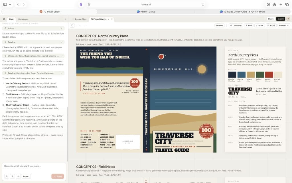
Concept 01: North Country Press — Mid-century WPA travel poster energy. Bold geometric landforms, Alfa Slab type, a cherry-red badge with “100” celebrating the Cherry Festival. The kind of thing you’d frame and hang on a wall.
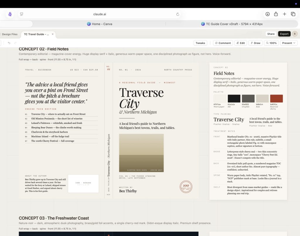
Concept 02: Field Notes — Magazine-cover editorial. Huge Playfair Display serif, warm paper background, a single disciplined photograph as figure. Voice-forward. Unhurried. More like a journal than a guidebook.
Concept 03: The Freshwater Coast — Nature-noir. Dusk lake photography, brass/gold foil accents, Cormorant Garamond italic. The premium shelf presence version.
Each came with a full design spec on the right panel — palette hex codes, type pairings, treatment notes for front, back, spine, and shelf appearance. I wasn’t just getting a picture. I was getting a system.
That’s what made it useful. Not that it generated something pretty on the first try, but that it gave me three genuinely different directions to react to. I knew immediately which one I wanted to develop further. That clarity is hard to get staring at a blank document.
10 Things You Can Build With Claude Design Right Now
The best way to get comfortable with a new tool is to have a reason to open it. Here are ten genuinely useful starting points — from quick wins to things that used to take a week.
1. A pitch deck from a rough outline. Type out your five key points, tell it the audience, pick a style, and watch it build slides that look like someone put real thought into them. Export as PPTX or send straight to Canva to finish. What used to take a full design day now takes an afternoon.
2. A waitlist page for an idea you haven’t shipped yet. Give it a one-sentence concept and ask for a minimal launch page — single pitch line, email capture, a counter showing how many people are already waiting. Simple, fast, and shareable before you’ve written a line of code.
3. A product walkthrough your team can actually react to. PMs: instead of writing a six-page spec, give Claude Design your feature brief and let it build something people can click through. Static mockups that show what a feature actually looks like compress a week of back-and-forth into one conversation.
4. A cover for something you’re creating. Book covers, zine layouts, report covers, newsletter headers — anything that needs a visual identity but doesn’t need to live in Figma. This is exactly how I used it for the Northern Michigan travel guide: three fully realized cover concepts, each with its own design system and type pairing, in a single session.
5. An investor one-pager. Tell it your company name, your thesis in two sentences, your four key metrics, and your ask. Claude Design builds the single-page format that VCs actually read before a meeting — clean typography, logical layout, ready to export as a PDF and send.
6. A landing page first draft. You don’t need a developer or a page builder to get a first version in front of someone. Give Claude Design your copy, your brand colors, and a screenshot of something you like, and it’ll give you a working HTML page you can share or hand off to Claude Code to build for real.
7. Slide decks for talks, classes, or client presentations. Use the “plan mode” approach — ask Claude Design to interview you before it builds anything. Tell it the audience, the length, the vibe. Let it ask its 12–15 questions. The output will feel like you briefed a designer, not like you used a template.
8. A mobile version of something you already built. Duplicate your existing web project, prompt it to show the same design in mobile format, and get nine mockups across your different variants in one pass. Changing screen size used to mean starting over. Now it’s one prompt.
9. An animated explainer or video asset. Claude Design outputs real code, which means it can include motion — scrolling animations, transitions, even video elements. If you need something that moves, you can build it here and export the HTML. The only current catch is you’ll need to screen-record it to save it as a video file.
10. A marketing one-pager your whole team can edit. Build it in Claude Design, export it to Canva, and it becomes a fully editable Canva document — your team can jump in without needing access to Claude at all. Perfect for campaign briefs, internal announcements, or client-facing summaries that need to look polished but stay flexible.
Where Your Designs Can Go From Here
Claude Design isn’t a destination — it’s the fastest way to get from an idea to something real enough to share, refine, or build from. Here’s what the export paths actually look like in practice:
→ Canva — Your design arrives as a fully editable Canva document. Every element is unlocked: colors, fonts, layouts, images. Your whole team can jump in without needing a Claude account. This is the best path for anything marketing-related that needs to stay collaborative and editable — campaign assets, social posts, client deliverables.
→ PDF — Clean, flat, and ready to send. Best for one-pagers, investor summaries, print-ready covers, and anything that needs to land in someone’s inbox and look professional without them opening another app.
→ PPTX (PowerPoint) — Your slide deck exports as a proper .pptx file you can open in PowerPoint or upload to Google Slides. Worth knowing: complex backgrounds sometimes simplify in the conversion, so export early in your process and check it before you’re under deadline.
→ Standalone HTML — Because Claude Design builds in real code, not flat images, the HTML export is a fully functional file that runs in any browser. Good for sharing interactive prototypes externally, embedding on a site, or keeping a working version of something without a hosting setup.
→ ZIP Archive — The full folder of everything: HTML, CSS, assets, and design files. Use this when you’re handing off to a developer or want to bring the project into your own environment and keep working on it locally.
→ Claude Code — The handoff that makes Claude Design worth it for anyone building real products. Claude packages your design into a bundle your Claude Code session can receive with a single instruction. The jump from “this is what it should look like” to “this is running in production” becomes one step, not a weeks-long translation project between design and engineering.
→ Shareable URL — Not an export in the traditional sense, but worth knowing: you can share a link to your live design with view-only, comment, or edit access. Recipients don’t need a Claude account to view it. Great for quick stakeholder feedback before you’ve decided where the final version lives.
The best way to learn Claude Design is to give it something real to work on. Not a practice project. Something you actually need. The feedback loop is fast, the stakes are low, and you’ll figure out your own usage rhythm quickly. Start with none as your design system, high fidelity as your mode, and one piece of visual inspiration you can reference. That’s enough to get somewhere useful.